A remembrance of Kevin Drum and his time-series charts
Kevin Drum's writing was crystal-clear, heterodox, very opinionated, and often illustrated with time-series charts. Here's how I learned to love those charts by reading him.
Kevin Drum, one of the original bloggers, passed away on March 7. His death was not really a surprise to the people who read him regularly—like me—because he had been fighting with multiple myeloma since 2014 and his health updates starting from the past month were pretty grim: he’d gotten pneumonia and was having trouble breathing and his doctors were having a hard time making his breathing easier. His last post was characteristically blunt: “Everything is getting worse.” Because even his health updates—like his other writing—tended to be matter-of-fact and cautiously hopeful, I believed him in his final updates when he thought the end was near while also hoping that he would recover. But that was not to be.
I have been reading Kevin for almost 20 years now. I don’t quite remember how I found him. I came to the US in 2002 and this was what some might now call the golden age of blogging. People we ended up calling bloggers were often not working journalists; they were people who loved to write, who had something to say, but who were also working day-jobs or going to college. They set up their accounts on Blogger or Typepad and started typing away their takes on politics, the economy, or whatever else took their fancy.
I found the bloggers to be very, very exciting. They wrote in a voice that was very different: personal, fact-based, but without the invisible-reporter-view-from-nowhere that one saw on CNN or in the newspapers. The bloggers I ended up gravitating to were those that did empirical policy analysis (Yglesias, Klein, Drum) rather than those that tended to be more philosophical (Sullivan) or oriented towards reporting based on tips and scoops (Josh Marshall).
So that’s how I ended up reading Kevin Drum. I believe he was already at the Washington Monthly writing the Political Animal blog (the first post of his that I seem to have written about is this one); I followed him from there to Mother Jones where he wrote for 10-odd years and then to his personal blog. Kevin was never shy about his opinions but he was an empirical guy. He tried to dig around for data as evidence for his views and he did his best to present that evidence as justification. He generally avoided hyperbole or outrage; he tended to write in a matter-of-fact tone even when he was annoyed with Republicans.
His basic positions on these issues stayed the same; Kevin was a common-sense-driven center-left guy and in all the 20 years I have read him, I have never seen him carried away to any kind of excess, yes, even during the somewhat crazy days of the George Floyd protests. Ben Dreyfuss recently revealed on his Substack that in his tenure at Mother Jones, Kevin did not take a single raise even though he drove a lot of traffic to Mother Jones and instead asked that this money be used to fund other reporters who were just starting out. Editor Clara Jefferey pretty much confirmed this and added that he, Kevin, did not want this fact to be known. This does not surprise me in the least because that’s how Kevin came across on his blog; someone who had both strong fact-based opinions who liked to write but also self-effacing at the same time.1
Anyway, what I am saying here is something that plenty of other people who read Kevin will also say. So I wanted to use this post to write about something that I learned from Kevin Drum: the value of time-series charts. I encountered them the most on his blog and over time, he convinced me of their value to the point that I now spend a week in my “Research Methods” class teaching undergraduates how to make time-series charts and use them for understanding how or why things happen.
The time-series chart, explained
A fairly typical Kevin Drum post would go something like this. He would read an op-ed that would say something like “Loneliness has never been more than it is now” or “the cost of a house has never been as unaffordable as it is now”—you get the idea. And Kevin would sigh and produce some kind of time-series chart: the median cost of a house across time (normalized by inflation!—that was big for him) and the median income (normalized by inflation!) across time. And he would say: does this look to you as if housing has become unaffordable?
Now, to be clear, this approach has its limits (as many commenters probably did say). It could be that this was fine at the national level but not, say, in the San Francisco Bay Area. Maybe this was fine for all Americans on an average but perhaps it was not so for a particular group of Americans (living in the Bay Area, people in service jobs, and so on). But overall, I found it a good checking tactic; if you think something today is worse than it was before, find some metric and go look it up first!
I remember many posts like this but I can’t find one quickly in my bookmarks but here is one I found via Google with the title “Stop whining” (it’s in the URL) that seems to have been later changed to “Stop telling everyone life is horrible.” Kevin was mad—in his common-sensical way—with people going around telling everyone that
Young people are TIRED.
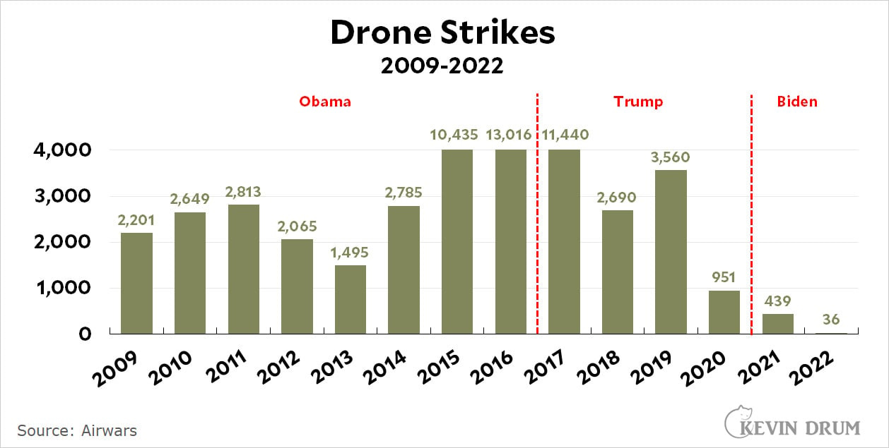
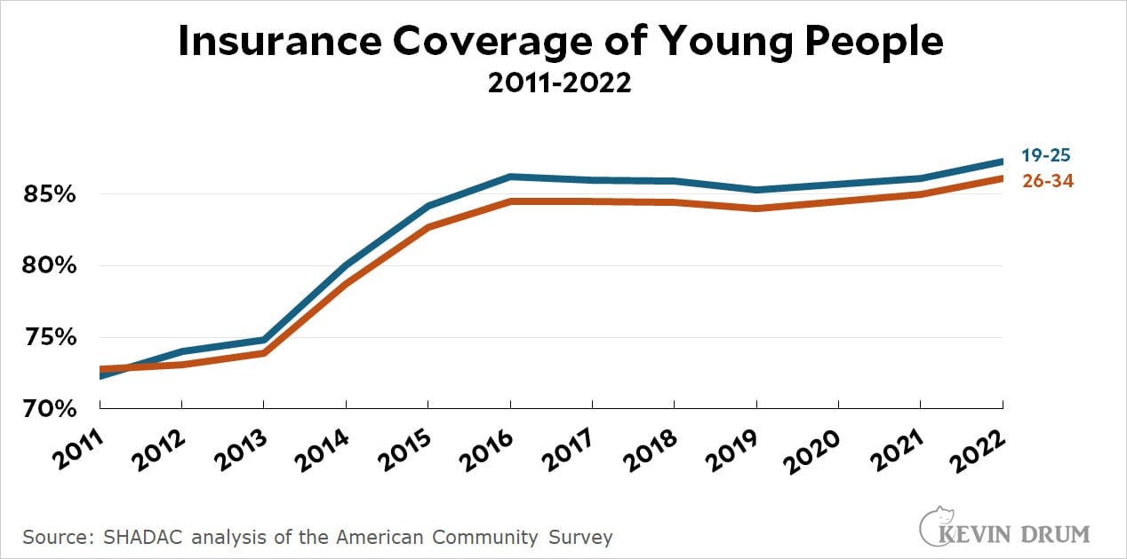
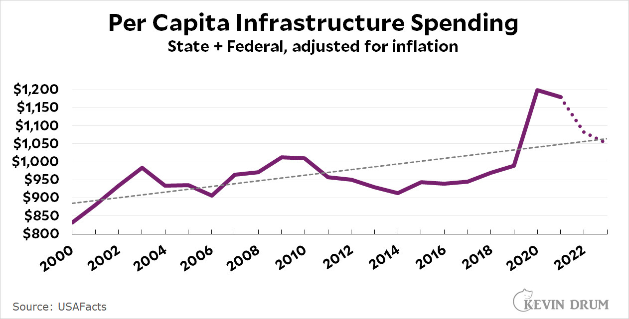
They’re tired of growing up with forever wars, with no healthcare, with crumbling infrastructure. […] [This was a tweet which I don’t want to embed here but which you can find embedded in Kevin’s post.]
Kevin thinks that things are, of course, bad in some ways but they are not bad in others. And to show this, he produces three graphs touching each of those three areas in the tweet that irritated him: wars, healthcare, and infrastructure.
The real upshot of these posts for me were the time-series charts that Kevin produced. They really made me appreciate what a good time-series can do.
It’s not like they couldn’t be argued with. Go through the comments through these posts and you can see about half of the commenters taking exception, starting from the first comment. That commenter even takes Kevin to task for “arbitrarily choose some measures going well as a metric for life/society […] One could choose levels of abortion access, queerphobia, or misinformation as criterias for how well we're doing.” Of course, Kevin was choosing measures based on what was mentioned in the original tweet. But the commenter continues:
Maybe instead of telling the kids they're fine compared to random statistics or your own weak memory of your experiences, act like a progressive and look at how things should/can be better. Cause a tread-line on a graph is not a story and it does not convince anyone not already in your camp.
Fair enough. But this gets to what got Kevin to write this post in the first place. “Act like a progressive and look at how things should be better” leads progressives to places where they don’t even acknowledge any progress that has been made in the first place. It convinces other die-hard progressives, sure, but perhaps not others who are not on the progressive bandwagon in the first place.2
But I digress. Look through the Kevin Drum archives and you will see posts and posts and posts filled with time-series charts (and not just necessarily because he disagreed with naysaying leftists).
On that little thing called causality
But what about causality, the most vexed issue in the social sciences? One of my two favorite Drum posts that I use in my class are about causality and whether it is possible to resolve the question of causality by looking at change across time.
In this one, titled “Suicide Rates Are Up, But the Most Obvious Explanations Are Probably All Wrong,” Kevin starts from a CDC report that showed that suicide rates were up in 2014.3 But his real target was a Washington Post report that rushed to explain its causes. As Kevin listed them, they were:
(1) Last decade’s severe recession
(2) more drug addiction
(3) “gray divorce”
(4) increased social isolation
(5) the rise of the Internet and social media
(6) economic distress
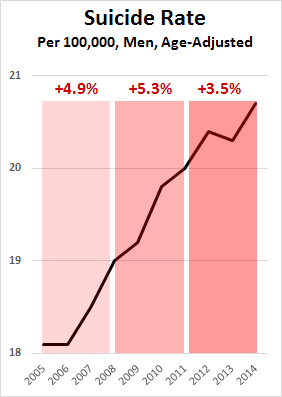
Did any of them matter at all? Did any one matter more than another? Kevin produces this chart looking at the increase in suicide rates over time and argues that the recession may not be as big a factor as people think:
With that in mind, let’s look at recent suicide rates for men. Not only does this help us control for gender, but it’s also a less noisy set of data since men commit suicide at nearly 4x the rate of women. It turns out that suicide rates barely budged between 1999-2005, so I’m going to look only at 2005-14. The chart [see above], with suicide rates divided into three 3-year buckets.
The Great Recession (and economic distress more generally) doesn’t really fit the facts. The suicide rate went up the most from 2005-2008, before the Great Recession. It went up the least from 2011-14. But if prolonged economic distress was at fault, you’d expect just the opposite: no effect before the recession and the greatest effect after it had been grinding away for a couple of years with no relief in sight.
Obviously, this does not settle the issue (and Kevin does not say that) but what I liked here was the idea of using the time-series chart at least as a check on theorizing. If the recession really drove suicide rates up, it does help to check how much suicide rates increased before the recession—and even a simple check shows that they did.
I try to explain this to my students; though I am not sure if they understand or not.
This one came from the red-hot summer of 2017 (it seems tame now compared to the red-hot summer of 2020) and the post was published on Aug 15. It was the high days of #ressistance and we had just had the Nazi rally in Charlottesville. Temperatures ran high on the liberal side; debates erupted about about whether confederate memorials should be renamed or even taken down.
But there was a big causal question: how do you know if those memorials had been erected for benign reasons—a memory to the numerous confederate soldiers who died or even as a memorial to particular leaders—or for racist ones? In this post, Kevin used data from a report that had been published by the Southern Poverty Law Center that included details about specific monuments (it also included roads renamed after Confederate figures).4
The original SLPC report included a very different visualization but I would argue that Kevin’s time-series chart was superior. It was a line-chart which allows readers to see the crests and troughs, with clearly demarcated periods of what was going on at that time. Kevin’s point (which is the same as the SLPC’s) is that the biggest spurt of these memorials were erected at the beginnings of the Jim Crow era and then there was a smaller spurt during the Civil Rights movement.
Again, none of this is slam-dunk (Kevin dealt with the objections in a subsequent post) but I use it to show students that time-series charts can be good not just to see how things changed over time but also why they might have changed over time.
On the question of the Y-axis
At other times, Kevin got into somewhat wonky questions about how exactly these time-series charts should be plotted.
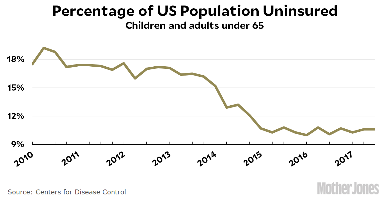
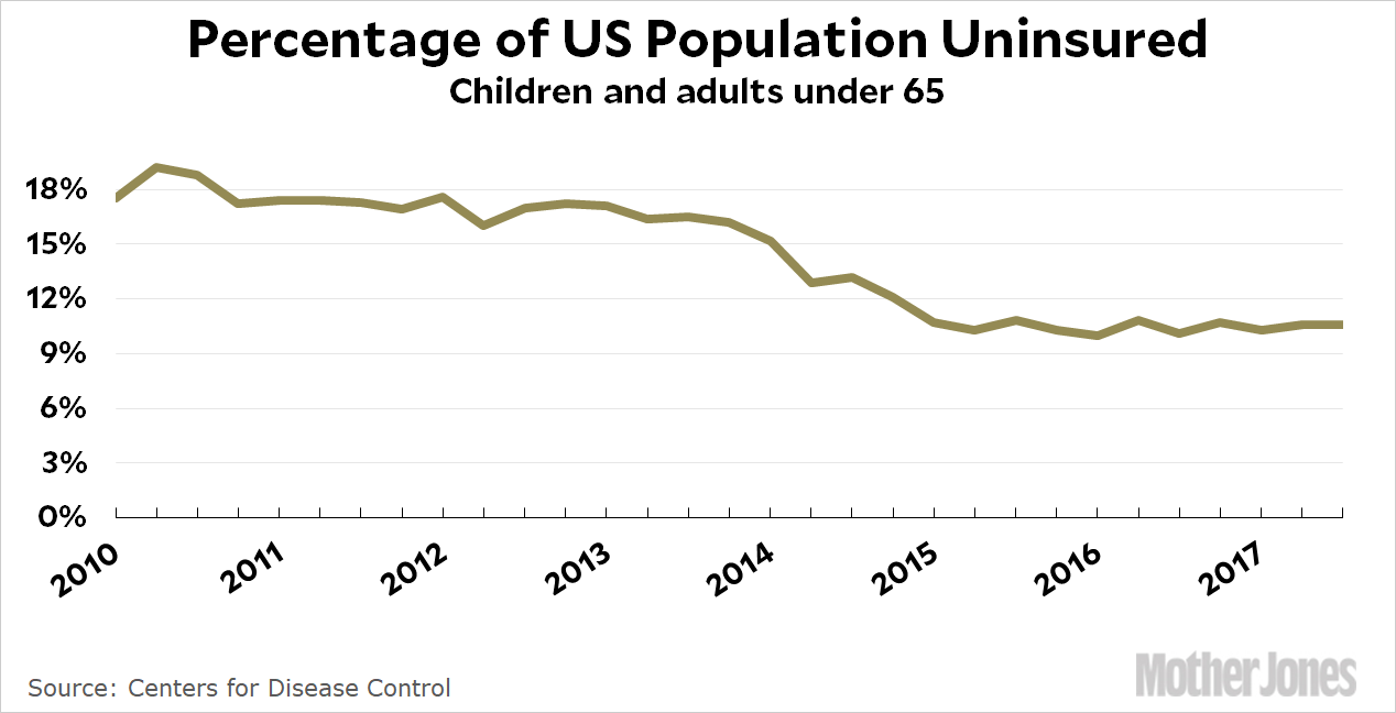
This post, in particular, is a great blow-by-blow account of what the scale of the Y-axis should be if you want to both (a) convince the viewer of your point, (b) without cutting any theoretical corners that borders on manipulation. My favorite charts here are the last two:
Which one is better? The top one eliminates dead space and shows the variations better. However, the quarter-to-quarter variations aren’t really that important, and someone skimming the post could easily think that it shows a drop in the uninsured nearly to zero. So maybe the bottom chart is better?
This is where it gets tricky. When the useless white space is 90 percent of the chart, it’s an easy call to get rid of it by moving the y-axis. But how about when the useless white space is only half the chart? Or 60 percent? Or 70 percent? What then?
There’s no easy answer. In this case, I’d probably give the nod to my critics and say that the chart starting at zero is better. You don’t really lose much, and it makes it clear how much further we have to go before we cover all the uninsured who are left. Luckily, the added white space in this particular chart isn’t huge, so we have the option of doing this.
What about when you are plotting two different metrics on the Y-axis? Kevin favors this, on the whole, but hassuggestions.
None of these last few links about the scale of the Y-axis or the dual-Y-axes question has made it into my course. It’s hard enough to get students to plot the right charts without going into many of these fine points.
To sum up
It feels odd to be sad over someone’s death when you never met the person (most of Kevin’s long-time readers say the same thing). But that’s partly the magic of blogging. Kevin shared some details about his life on his blog, especially his cats, his photography and amateur astronomy, and then later, about his illness. But he did all of that in a very consistent voice that became recognizable to many of us who read him for over two decades. Paul Glastris, who edited him at the Washington Monthly, wrote a lovely obituary (in which he called Kevin an “amateur Renaissance Man”) with the following line:
Some writers are different in person than they are on the page. That was not true of Kevin. If you followed his blogging, you pretty much knew the man. He was what I would describe as deeply normal.
I’m sad that his RSS feed, which had always been active over the last 20 years, will now never update again. But, hopefully, I have managed to transmit at least some enthusiasm for time-series charts to some young people somewhere.
Kevin often didn’t specify where exactly he found the data for these charts but that was okay: he was not writing a research paper and I suspect, he would have gladly explained his methodology if anyone had asked him.
How up? As the CDC report puts it in its cryptic style, “From 1999 through 2014, the age-adjusted suicide rate in the United States increased 24%, from 10.5 to 13.0 per 100,000 population, with the pace of increase greater after 2006.”
The report is not at the original link but the link I provided goes to an archive from Princeton University. You can find a lot of other information on this from SLPC here.


This is an outstanding tribute to a great blogger. Thank you for writing this.